Welcome to the Future, or Just a Glimmer?
iOS 26 has arrived, and with it, a seismic shift in the iPhone’s visual language. Prepare yourself for an interface that aspires to be less about rigid pixels and more about the fluidity of, well, liquid glass. Imagine frosted glass bubbles gently floating across your screen – a translucent dance of form and function. A deep dive into Apple’s latest visual revolution.
This isn’t a screen protector we’re talking about. This is a fundamental reimagining of the software aesthetic, a philosophical shift expressed in shimmering pixels and refractive layers. Apple promises a unified, immersive, and undeniably delightful experience across your entire ecosystem.
The question, of course, is whether the reality lives up to the promise. It’s undeniably stunning, but perhaps a little too much for some sensibilities. Fear not, fellow digital travelers, for we shall navigate this glassy landscape together, showing you how to bend it to your will and make it perfectly, idiosyncratically yours.
Diving Deep: What Exactly is Liquid Glass?
Let’s be clear: Liquid Glass isn’t a mere cosmetic upgrade. It represents the most significant visual overhaul since the great flattening of iOS 7. It’s a statement.
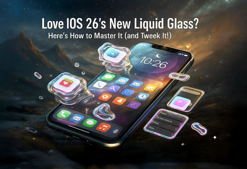
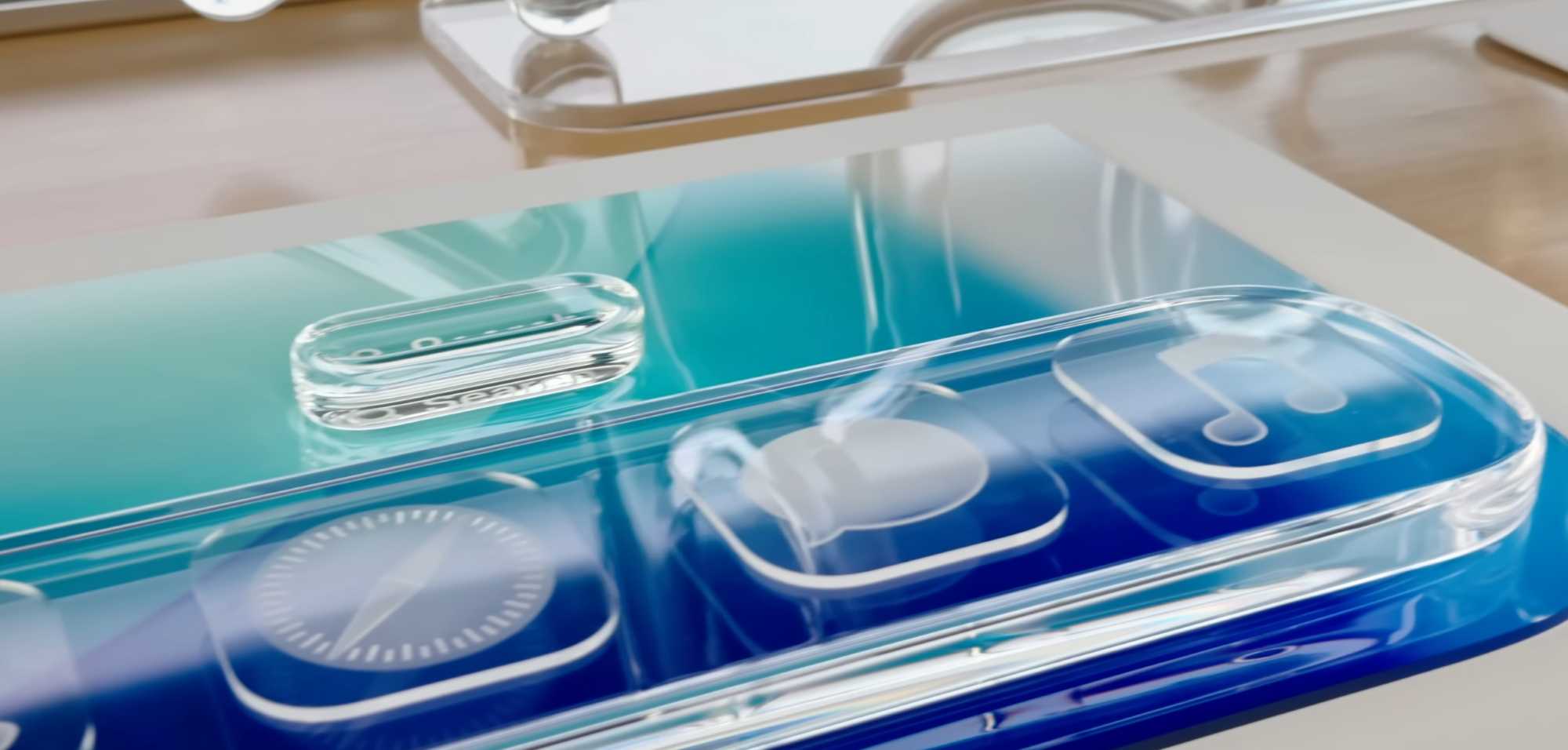
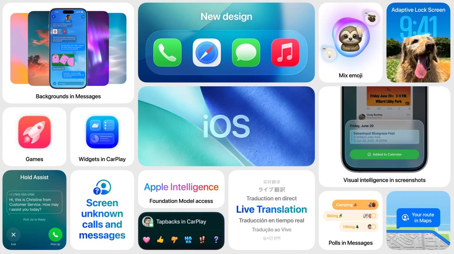
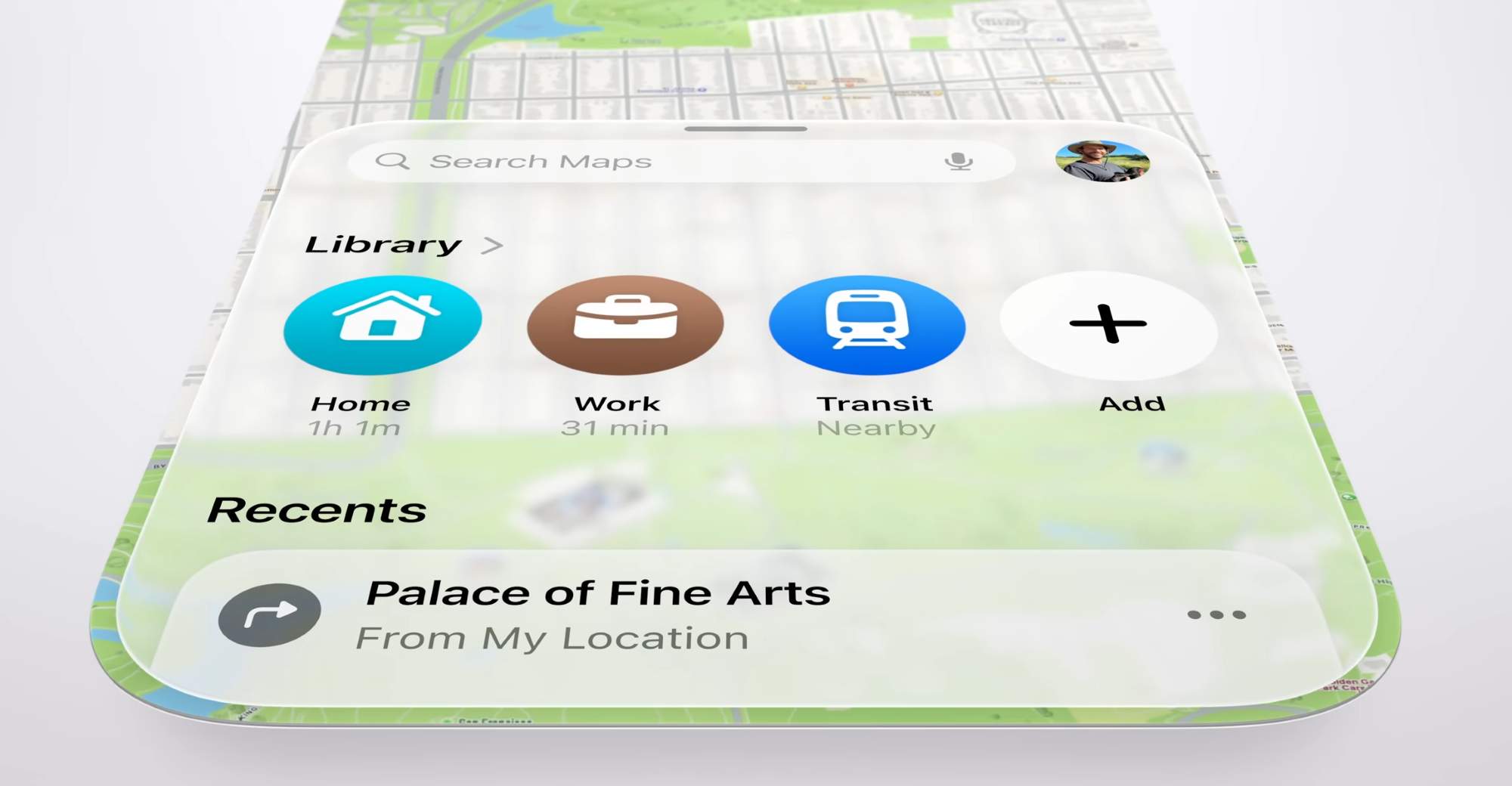
The core idea revolves around translucent, fluid, and subtly reflective elements permeating the entire user experience. Think softer, almost organic, rounded corners and shapes replacing the sharp edges of yesteryear. From the humble app icon to the commanding navigation bar, from the intimate Lock Screen to the utilitarian Control Center, everything has been dipped in this digital glass.
Key features that demand your attention: the dynamic interactions where buttons awaken with light, the tab bars that ebb and flow with your scrolling, the alerts that emerge from your touch. App icons, no longer static images, now show multiple “glass” layers, offering customizable tints ranging from the purity of light to the mystery of dark, and even a radical “all-glass/clear” option for the truly adventurous. The Lock Screen, once a static barrier, now becomes a canvas for dynamic clock scaling, translucent notifications that whisper rather than shout, and “Spatial Scenes” that attempt to breathe life into your photos, rendering them as shifting, 3D memories.
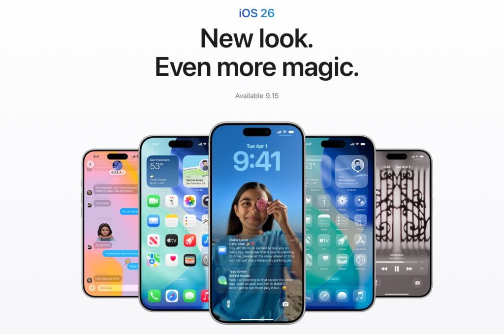
And it’s not just your phone. iPadOS 26, macOS Tahoe 26, watchOS 26, and even tvOS 26 have all embraced this glassy aesthetic, creating a unified and (hopefully) harmonious Apple experience across all your screens. In a symbolic break from the past, Apple has also moved to a year-based naming convention. Goodbye “iOS 19” (or whatever number we were on), hello “iOS 26.” A clean break, a fresh start, a glassy new world.
A Quick UI History Lesson: How We Got Here
To truly appreciate Liquid Glass, one must understand the historical currents that have shaped Apple’s design philosophy. Let’s take a brief journey through the world of UI history.
It begins, of course, with the primordial soup of the 1984 Macintosh, the birth of the graphical user interface itself. Black and white, yes, (actually black and green) but a revolution nonetheless. Then, fast forward many years, we come to the era of skeuomorphism, where digital objects desperately tried to mimic their real-world counterparts. Leather-bound calendars, wood-paneled bookshelves – a digital imitation of reality.
iOS 7 ushered in the “flat revolution,” led by Jony Ive’s minimalist vision. Gone were the textures and shadows, replaced by simplicity, vibrant colors, and a relentless pursuit of flatness. More recently, building blocks such as real-time blurs, fluid gestures pioneered by the iPhone X, and the dynamic island, have paved the way for increasingly interactive and layered interfaces.
Liquid Glass, in many ways, is a synthesis of these past philosophies. It draws direct inspiration from the 3D, immersive experience of Apple’s Vision Pro, attempting to bring spatial computing concepts to the more confined handheld screen. It’s a blend of the expressiveness of early skeuomorphism with the principles of modern flat design.
The Great Debate: Love It or (Secretly) Hate It? Current Opinions & Controversies
The reaction to Liquid Glass has been, shall we say, polarized.
There’s the “Fan Club,” those who find it undeniably fresh, bright, and futuristic. They revel in the feeling that their devices have come alive, breathing with a newfound sense of immersion. I personally follow that same feeling.
But then there’s the “Critics’ Corner,” and their concerns are not to be dismissed. The most prominent complaint revolves around legibility. The translucent elements, while visually appealing, can create a “legibility nightmare,” particularly when layered over busy wallpapers or in low-contrast environments. Accessibility advocates have been particularly vocal on this point.
Furthermore, some find the dynamic reflections and fluid animations to be a “distraction station,” visually complex and mentally draining. The constant movement can pull focus from the actual content, leading to cognitive overload. Some users have even reported experiencing dizziness.
Usability woes have also surfaced, with reports of inconsistent controls across different devices, elements that seem to disappear into the background, and awkwardly cropped content resulting from the pervasive rounded corners. Small app development teams are reportedly “scrambling” to adapt their apps to the new design language, adding to the sense of upheaval.
Initial beta tests raised concerns about performance, with users reporting stuttering and lag, highlighting the significant computational demands of real-time rendering. While Apple’s chips are undoubtedly powerful, pushing them to their limits can have unintended consequences.
Apple, to its credit, acknowledges that Liquid Glass is a “tricky undertaking” and has already implemented some tweaks, adding more “frost” to certain elements. Expect further refinements in future updates (26.1, 26.2, and beyond).
Your Guide to Mastering Liquid Glass: Settings to Tweak FIRST!
The key to enjoying (or for some, tolerating) Liquid Glass lies in customization. Fortunately, Apple provides a range of settings to fine-tune the experience to your liking.
First and foremost, prioritize readability. Accessibility settings are your best friend here. Navigate to Settings > Accessibility > Display & Text Size and toggle Reduce Transparency ON. This significantly darkens translucent elements, making text and icons far more legible. While you’re there, toggle Increase Contrast ON. This adds subtle outlines to elements, further enhancing their distinction from the background. If the fluid animations are causing you discomfort or distraction, turn Reduce Motion ON to minimize jarring transitions and parallax effects. I’ve already adjusted these settings for my mother.
Next, personalize your icons. Long-press on your Home Screen, tap Edit, then Customise. Here, you can experiment with Clear Light, Clear Dark, or Auto options to achieve that refractive icon effect against your chosen wallpaper. Remember that you can also choose light, dark, and color-tinted versions for your app icons and widgets.
Don’t neglect your Lock Screen. Adjust the clock style, experimenting with the Liquid Glass option. Tinker with the appearance of notifications, choosing between frosted and clear. And, if you’re feeling adventurous, play with “Spatial Scenes” for a 3D wallpaper experience.
Finally, keep an eye out for updates to your favorite third-party apps. Developers are actively integrating the glassEffect modifier, allowing them to offer their own Liquid Glass customization options within their apps.
Beyond Today: The Future of Apple’s Glassy World
Liquid Glass, in its current form, is just the beginning. Expect Apple to continuously refine the design language, likely making transparency more adaptive, contrast AI-tuned, and overall effects less distracting based on user feedback.
But the future extends beyond software. Apple has long been exploring “Liquidmetal” (a durable amorphous alloy) for hardware applications, such as the hinges of future foldable iPhones, aiming to minimize creases and maximize durability. Patents hint at the possibility of an “all-glass iPhone” or “wraparound displays,” realizing Jony Ive’s ultimate vision of seamless form. Rumors of a foldable iPhone, potentially arriving in late 2026 or early 2027, with curved glass sides, align perfectly with the fluid aesthetic.
The iPhone 18 Pro (anticipated in 2026) might even introduce under-display Face ID, moving towards a truly “all-screen” design. Further down the road, tandem OLED displays (potentially in post-2028 iPhones) promise increased brightness, efficiency, and longevity.
As Liquid Glass draws inspiration from visionOS, expect deeper integration of 3D environments and advanced Augmented Reality (AR) experiences on your iPhone, blurring the lines between the digital and physical worlds. And, of course, AI will play an increasingly important role. Apple Intelligence will likely dynamically adapt Liquid Glass UI elements to your context and content, making the interface smarter and more responsive than ever before.
Conclusion: Embrace the Sheen, or Dial it Down
Liquid Glass represents a bold, beautiful, and, at times, divisive new chapter in Apple’s UI evolution. It’s a testament to Apple’s relentless design ambition and the raw power of its custom silicon.
The good news is that you have the power to customize and adjust it to your liking, ensuring that your iPhone experience is as smooth and clear (or as opaque!) as you desire. So, go forth and tweak those settings! Make Liquid Glass truly yours, a personalized reflection of your digital self.